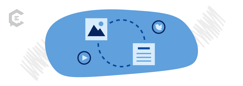
What are content elements? Content elements are individual design and user experience (UX) components that tie messaging and brand experiences together. As a standalone piece, a content element does not convey the brand message or vision. When content elements work seamlessly into the messaging, they help bring the content vision to life.
Working with a content marketing hierarchy is one way to organize the many structural abstracts of your content. Lower levels in the hierarchy lend support to the higher levels. Whichever way you approach your content, looking at your greater content hierarchy is a great mental exercise to consider.
If you missed our detailed walk-through of the other 10 content levels, you will find them linked below. Today, we are covering the very last content level… content elements.
Content elements are the stock photos and emojis that get slapped onto a piece of content, often moments before the content is released into the digital world. But, their impact is significant. And it’s time to care more about which content elements you choose and how they work to deliver the bigger vision.
Content elements are the unsung heroes of our brand experience. Learn about their significance in your content creation process and how to leverage elements to harmonize your brand.
What are content elements?
Content elements are individual design and user experience (UX) components that tie messaging and brand experiences together. As a standalone piece, a content element does not convey the brand message or vision. When content elements work seamlessly into the messaging, they help bring the content vision to life.
The 11th level in the content marketing hierarchy, content elements are at the bottom of the list. But that should not belittle their content status. Content elements serve as the building blocks for all of the other content levels. A content element might be a graphic, photo, font, or form — to create a cohesive brand experience, you need the right content elements in place.
Sometimes content assets (#10) and elements are used interchangeably. For the purposes of our brand hierarchy, they are different in that elements are part of assets, and you promote assets, not elements. Infographics are an easy example. The fonts, color palette, and graphics are the content elements that band together to build the infographic, which is a content asset.
With the prominent role emojis play in communication today, emojis could also be considered a content element that subtly impacts your brand experience. An emoji may seem trivial, but it’s still a choice content marketers have to make — perhaps on a daily basis if you count social media updates and comments and the rise of emojis in email subject lines and body text.
Using content elements to harmonize your brand
A content marketer’s partner in crime is their design partner. That’s why we could think of no better person to ask questions about design elements than David Bailey of David Bailey Design. As a professional designer and developer who has worked with major brands like Coca-Cola and Mastercard, he shares his expertise below in our mini-interview to help you improve the way you incorporate content elements into your overall brand experience.
Why does brand consistency matter?
Without consistency, there really is no brand. Through the curated use of images, type, and color, as well as content tone and voice, consistency is what creates the brand.
What steps should content marketers take to improve brand consistency?
Create a brand book, and try to stay mostly within those guidelines when creating new content elements. Sure, strict adherence to a set of rules may seem tedious after a while. But remember… as soon as you start to feel bored with your brand, that’s the time your audience is starting to notice it.
What are the most common mistakes you see with fonts being used across content marketing assets?
Using too many fonts. A little goes a long way for most things, and fonts are no different. Hopefully, your brand utilizes a couple of good solid type families that cover a range, from light to bold, for a variety of uses.
Adding a new display font for a content campaign is a great way to spice things up — perhaps using a font that looks like bamboo to promote an event in a tropical locale. It can work if this font is compatible with other branded fonts, and if it’s used in moderation. Don’t make the whole campaign look like it’s an ad for a Tiki bar.
What are the most common mistakes you see with color palettes being used across content marketing assets?
This may seem odd, but I think sticking too closely to a fixed color palette for all parts of a campaign can be a mistake. Brand color palettes are usually divided into primary and secondary colors. If you are consistent with those primary colors, you can have a bit more flexibility with adding other colors into the mix, especially for short duration campaign elements.
As long as those colors are harmonious with the overall palette, I say go for it. And if you need to make it official, add some tertiary colors to your brand book.
What advice can you pass on to non-designers to help them pick out better stock photos for their content?
I’ve spent hundreds and hundreds of hours scrolling through stock image websites in my career. My advice would be to take the time to find the right image, and don’t settle for a literal representation of your content’s message.
Go for something that’s evocative and emotional — and try things that are unconventional and unexpected. When searching for fresh stock ideas, try slightly off-topic keywords. And to keep your communications looking different than everyone else’s, look beyond the first page of the search results.
3 branded examples of content elements
In 2021, 50 percent of marketers started or accelerated digital initiatives, according to Bynder’s State of Branding Report. To make sure your content investment is worth it, step away from your content campaign or website rebrand for a moment. You need to see how all of the pieces, no matter how small, interact and coexist.
Moral of the story? Content elements should never be an afterthought — they should harmonize your brand. These branded examples show the strategy and care that went into the details to capture the brand personality, allowing it to sing beyond the digital page.
Content element: Demo form
Forms are arguably one of the most important content elements on your website. For product companies, the conversion priority is all about the coveted demo. As we might expect from a digital asset management solution for marketers, Bynder strikes a beautiful balance with their demo page.
Minimal and friction-free, their form cuts to the chase. On the left of the form, they entice web visitors to sign up by highlighting the persuasive number of brands that already have. Right below is the “schedule a demo” messaging CTA. It’s clear that the Bynder team thought this conversion point through.
Content element: Custom graphics
Buffer’s home page features custom graphics in bold colors that highlight the brand’s personality.
Most brands do not get this right. They do stuffy or cheesy headshots… or worse… stock photos of random people who don’t even work at the company. Buffer is getting this content element right. The home page helps establish that Buffer is a personable brand with a product that can solve many a marketer’s woes, leading the visitor to click “get started now” or “watch video.”
Content element: Clever graphics
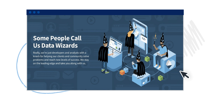
This final content element example is from Skypoint CSG, a data analytics consultant company. Since their clients call them “Data Wizards,” this brand theme was used throughout the messaging and content elements. Rather than simply using off-the-shelf stock illustrations, David Bailey (yes, the designer we interviewed earlier in this article) doctored the vector files to infuse more brand personality.
Content elements add emotional flair to written content. To successfully design a cohesive brand experience, marketers must recognize the power of these elements, whether they are selecting a header font or an icon.
The next time your team is creating content, bring elements earlier into the conversation so you have a better chance of pulling everything together to harmonize your brand.


