HubSpot— if you’re not yet leveraging its powers to grow your audience, you should be. After all, it’s widely considered a leading marketing automation platform for content marketing. According to Digital22.com, HubSpot is “the best software for an inbound strategy” in part because “content can be tailored precisely to target where a user is in their own personal buyer’s journey.”
Many companies recognize the value of HubSpot for email campaigns. They love being able to segment customer lists, create email workflows, and see customer actions related to emails. However, one thing I’ve seen with many of my clients using HubSpot is that all their doing with it is sending one-off emails. If that sounds like you, you’re missing out on one of its most powerful features — the ability to serve as an audience-growth machine through freelancer-generated content. Explore how you can grow your audience with content for HubSpot, generate new leads, and boost your revenue.
Recognize the overabundance of content
Plenty of bloggers and businesses are giving away free content, in the hopes of gaining new customers. In a post for HubSpot, Justin Lee explain that “Brands are generating more [content] than ever, with one study counting a 300% increase this year compared to last.” With all those freebies floating around the digital world, it’s vital to ensure that your content is tastier and more tempting to consumers.
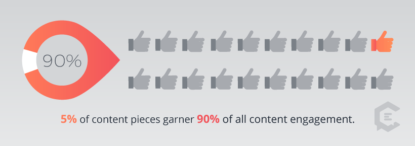
A report from Beckon reveals that about “5% of branded content garners 90% of total consumer engagement.” So there’s a lot of content out there that is simply going unnoticed and unused.
The HubSpot team has the solution for you. “Publish less,” Lee writes. “Publish well. Publish only when you have something valuable to say.”
Identify your target audience
Before you get started producing new content for your HubSpot growth strategy, you’ll need to have a crystal-clear picture of your target audience. What kind of customers and readers do you want to attract? What are their needs and desires, and how can you speak to those issues?
Develop “buyer personas” to guide your content development. Writing about how to create B2B buyer personas, Britt Skrabanek os Superneat Marketing explains, “A B2B buyer persona represents your ideal client decision-maker. When developing your buyer persona, address all the issues and aspects that may have an impact on how, when, and why the person will buy. These factors include demographic information, patterns of behavior, motivation, and goals.”
Creating buyer personas takes some time, but it’s incredibly important as you clarify your audience and work towards building valuable, shareable content that will eventually increase revenue. To get started, check out another ClearVoice article, “Stop Talking to Yourself: Creating Creative Personas” by Melody Valdez.
Identify relevant keywords
Keyword research isn’t necessarily fun, but it’s vital if you plan to gain a decent rank in popular search engines. Brainstorm some long tail keywords (three or more words) and short tail keywords (one or two words) that you want to go after and rank for.
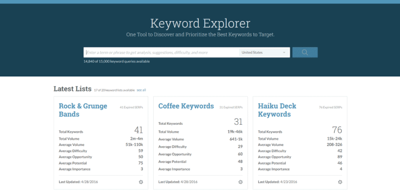
With the HubSpot keyword tool being recently retired, you’ll need to find another favorite keyword analysis tool. Check your brainstormed list of keywords using your tool of choice to find out what chance you have of ranking for specific phrases. Moz’s Keyword Explorer is a good place to start. Focus your efforts on specific keywords for your pillar page, and support that webpage and its ranking with extra keyword-rich content.
Develop a content strategy
If you’re going to stand out in the marketplace — if your content is going to get noticed and read— you’ll need some well-written, evergreen pieces that are simply irresistible to your target audience. We’re talking how-to pieces, case studies, origin stories, tips, and comprehensive guides. Focus on basic information that meets needs that human beings will always have.
Evergreen content, according to the Ahrefs Blog, is “content you write once and have it ranking for years and years. Content that constantly brings in traffic and compounds in value.” Throw in a few trendy temporal topics with the evergreen ones, and you’ll have a winning combination.
HubSpot’s content strategy tool offers you crucial support as you develop your content. Type in a core topic and the HubSpot AI will reveal subtopics that might be of interest, in the form of a “topic cluster.” Use this information to shape your topic strategy.
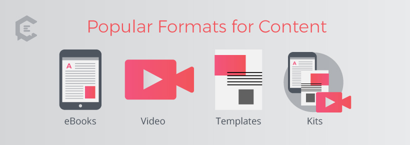
Use popular formats for your content
What are the most desirable formats for gated content? According to the Overthink Group, they are the following:
- Ebooks (in PDF format)
- Videos (on-demand videos, live videos)
- Templates (so marketers can put their content into Excel, Illustrator, or Powerpoint files)
- Kits (a collection of ebooks, templates, and other information about a theme or process)
There’s always a place for blog posts, too, especially those in list form. But gated content pieces typically need to be pithier and richer in value.
Find quality freelance writers
Where are you going to source all this magnificent content, these evergreen topics, and of-the-moment articles? You’re going to need the help of a professional freelance writer — probably more than one.
Take a look at the ClearVoice Talent Network, where you can hire vetted, experienced writers with excellent credentials and fully manage their content creation within the same platform — before seamlessly publishing via ClearVoice’s integration with HubSpot.
You can find writers who can capture the right voice for your company, who understand what you need and what you’re trying to achieve. Don’t settle for less, but be willing to pay what it takes to get top freelancers to produce your content. Your target audience can tell when content lacks depth, or when it’s merely regurgitated from a single source; so be sure that you’re paying for quality, and you’ll receive a bountiful return on your investment.
Remember, great content isn’t just limited to the written word. Hire writers who are good at turning data and facts into video scripts, so you can draw in the people who would rather watch a video than read an article.
Once you have a healthy assortment of new content pieces coming in, you have to find a way to present each one to your audience.

Leverage the content strategically through newsletters
HubSpot excels at helping you build lists and automate emails. Of course, in order to maintain your readership and gain more opens and click-throughs, you’re going to need that fresh, appealing content your freelancers have been working on.
Insert the link to a piece of attractive gated content right in your newsletter. You can build up to it with some questions or a scenario that touches pain points with your readers — pain points that the gated content promises to soothe.
For example, let’s say that your team has produced a piece on “15 Myths of Website Design.” If you’re talking to marketers or web designers, that title is immediately fascinating. Push them to enter the “gate” by asking questions like, “Is your website functioning as it should in the modern marketplace? Have you fallen prey to these common myths of website design?”
Promising to expose secrets, explore a process, share tips, or reveal myths can get your content some initial attention, but be sure to have rich, meaty content to back up your promises. You want your readers to be pleased and satisfied with the content they find, so they’ll share it and keep coming back for more.
That’s the goal, of course — to produce content that adds value to your readers’ lives and builds customer loyalty. Some of your content may be similar to what’s already out there; but if you can collect the most valuable data, express it in a better way, and add fresh insight, your target audience will eat it up. They’ll share it, and their friends and contacts will become part of your growing audience. Before long, you’ll be enjoying the revenue expansion that you dreamed of seeing — all because you figured out how to grow your audience with content for HubSpot.