Wix vs. SquareSpace vs. Weebly: Which is the best website solution for small businesses and entrepreneurs? Each has a multitude of strengths, but they all have a few weaknesses to consider, too. The right choice for you depends on your web design proficiency, expectations, and business type.
For small business marketers and owners, one of your most important assets is your website. However, one of the most difficult assets to acquire is… your website.
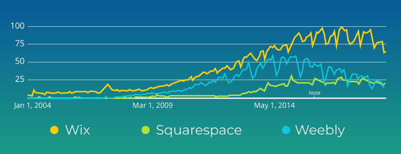
Thankfully, there are three very good solutions you can leverage to build a great looking website in as short a time as a few hours: Wix, Squarespace, and Weebly. These three website building tools are very popular, according to Google:
While WordPress is by far the most powerful website building platform, it requires significant tech chops to get a good WordPress site off and running. In a Web Business Creation course I’ve been teaching at Brigham Young University – Idaho, the big project of the course is for students to create a website. In the course, we review a dozen or so different site builder options: Weebly, Squarespace, Wix, Webstarts, Google Sites, Yola, Homestead, Webs.com, Voog, Shopify, Joomla, Drupal, and WordPress.
The students generally select WordPress, Weebly, Squarespace, Wix or Shopify for their website build out. Those that select WordPress normally switch mid-semester to another solution that has less of a learning curve. Shopify is an excellent solution but is more targeted to e-commerce and so I don’t include it in this head-to-head comparison.
Judging process
I enjoying using each of these web builder tools and have no personal stake in any of these companies. To ensure I treat them in a fair, non-biased fashion, I will be using the following criteria to judge each solution:
- Time to get going. How hard is it to get started with the tool? Do they have training, tool tips, or videos to help you learn what you’re doing?
- Overall ease-of-use. How good is their user interface? How easy is it to use?
- Feature richness. Does the solution have features that make it stand out from the competitors?
- Design Flexibility. How flexible are your site design options? How many templates do they have? Are the templates easy to customize? Are they beautiful?
- Price. How much does it cost?
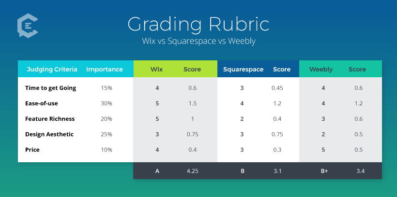
At the end of the article, you can see the grading rubric with the specific criteria weighting that I’ve used. I’ll also assign an “overall winner” to one of these three solutions. Please note that any mentioned features or prices are accurate as of the time of writing this article, and are subject to change.
Using Wix to build your brand’s website
Wix is one of the easiest website builders on the market. Even though their drag-and-drop website builder is hands-down one of the easiest to use, they continue to improve their product with more functionality and a lot of additional templates.
Wix strengths:
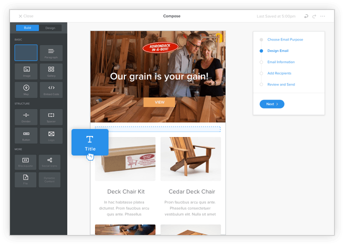
- Wix and Weebly both have email marketing solutions that you can buy as add-ons to their website-builder platform. While both are similar in functionality, Wix ShoutOut is the more affordable of the two. ShoutOut, when first released, started at $8.60/month, but has recently launched a more affordable version that will work for many small businesses, which starts at just $4.35/month, when paid for annually.
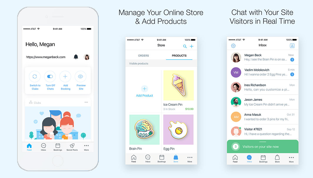
- Recently both Squarespace and Wix released a mobile app whereby you can update certain elements of your website from your smartphone. While both are still releasing updates on the apps, Wix leads the way with this mobile app (see screenshots above), allowing site owners to chat with customers, manage bookings, etc.
- In an exclusive interview with Shelly Cohen, the Head of Business Development for Wix, ClearVoice columnist Lena Katz captured 7 tips for creating a better website. One of these tips was to find a site builder with a mobile app, as “merchants [are] using mobile applications to manage their stores on the go. They do everything from chatting with customers (at any/all times) to managing inventory, bookkeeping, and marketing.” Wix’s best-in-class mobile app functionality gives Wix a significant lead in the ease of use category, as many small and medium business managers often find themselves on the go, needing to access their site backend.
- Getting started building websites with any one of these three web-builder solutions is not difficult. However, Wix ensures you won’t run into any problems with a robust “Wix Academy” where you can go to learn about building your website, choosing a good domain name, doing SEO, creating landing pages, blogging effectively, and more.
- With over 400 well-designed templates, Wix has the widest variety of options for small businesses that want to build a new website.
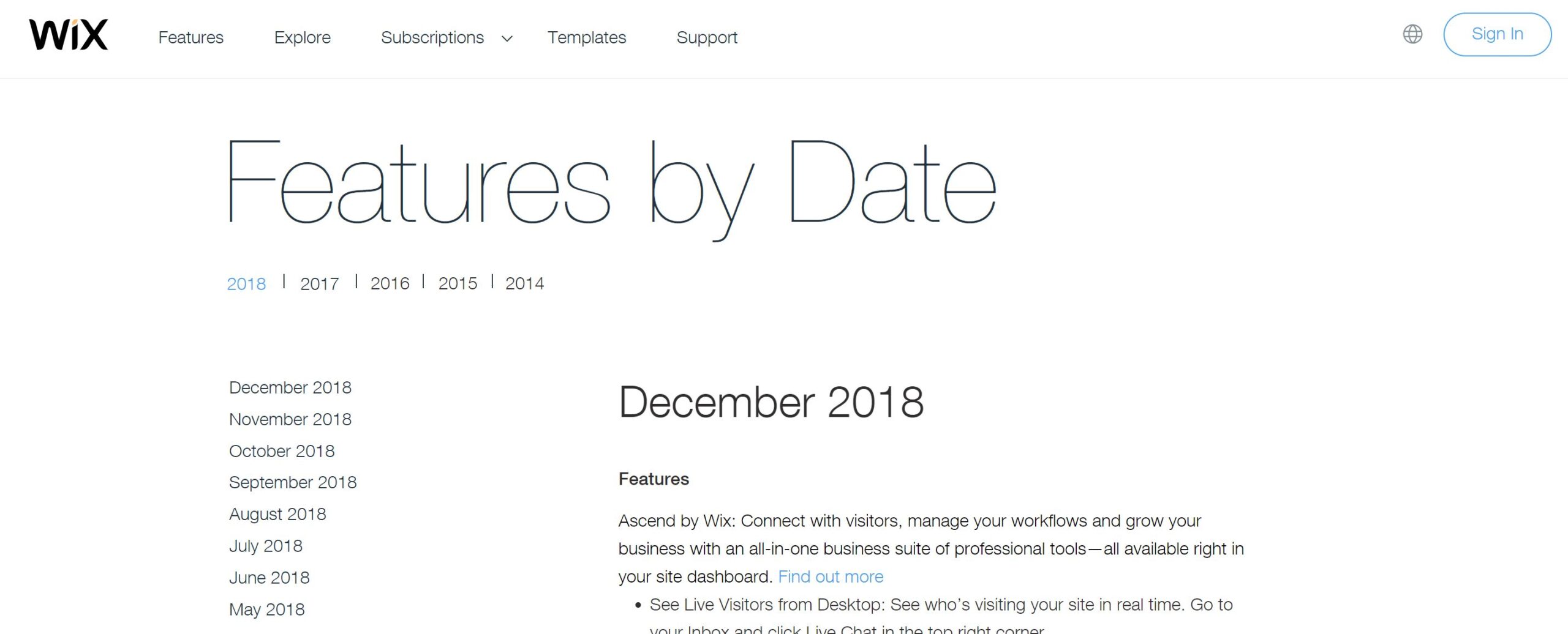
- Wix is the only one of these three website-builder solutions that have a changelog. While it isn’t clear who is developing and improving their tool the fastest, with Wix they actually show you all the updates they are making from month to month, which makes one tend to think that it is Wix. Neither Weebly or Squarespace have such a function. I really appreciate this feature improvement transparency from Wix, and think you will too.
Wix weaknesses:
- While Wix has a wide variety of templates available for use, one area that the Wix platform falls short is in transitioning to new templates. Because the content layout between templates is so different, and because Wix hasn’t created content cross-functionality in the templates, each time you want to move your site to a new template you’ll be copying/pasting content into the new content positions on your new website. An onerous task indeed.
- One area where Wix has a lot of potential to shine but doesn’t fully pull it off is with their app marketplace. Like each of these web-builder solutions, Wix has a robust market for third-party apps. However, for many of these apps, they are simply wrapping the other parties content in an iframe, which creates usability problems, especially on mobile devices where the content might not resize as it is supposed to. In addition to the iframe problem, they’ve got many apps that just don’t work well. Wix has a responsibility to make sure the entire user experience is a joyous one, and when working with some of these third-party implementations it is anything but joyous.
- Wix has traditionally been a little behind on SEO friendliness. They still lag a bit behind Squarespace and Weebly. Until late 2016, Wix had a horrendous way of naming pages — the url structure was really bad — and that hurt SEO. They also didn’t allow for alt tags on images, and were very poor in the blogging space. However, they’ve since fixed all but the blogging component, meaning they’ve taken great strides to get the SEO right. Because their system is not optimized for blogging, I would recommend WordPress over Wix if you’re looking to create an active blog.
Pricing:
Starts at $11/month when paid annually (pricing page)
Grade:
A (4.25 out of 5 possible points)
Using Squarespace to build your brand’s website
Squarespace prides itself on beautiful design, every time. While the Squarespace feature set is robust, and the design options are outstanding, they have done a great job at keeping it simple. If you’re looking for a high-class, beautiful website, then look no further than Squarespace.
Squarespace strengths:
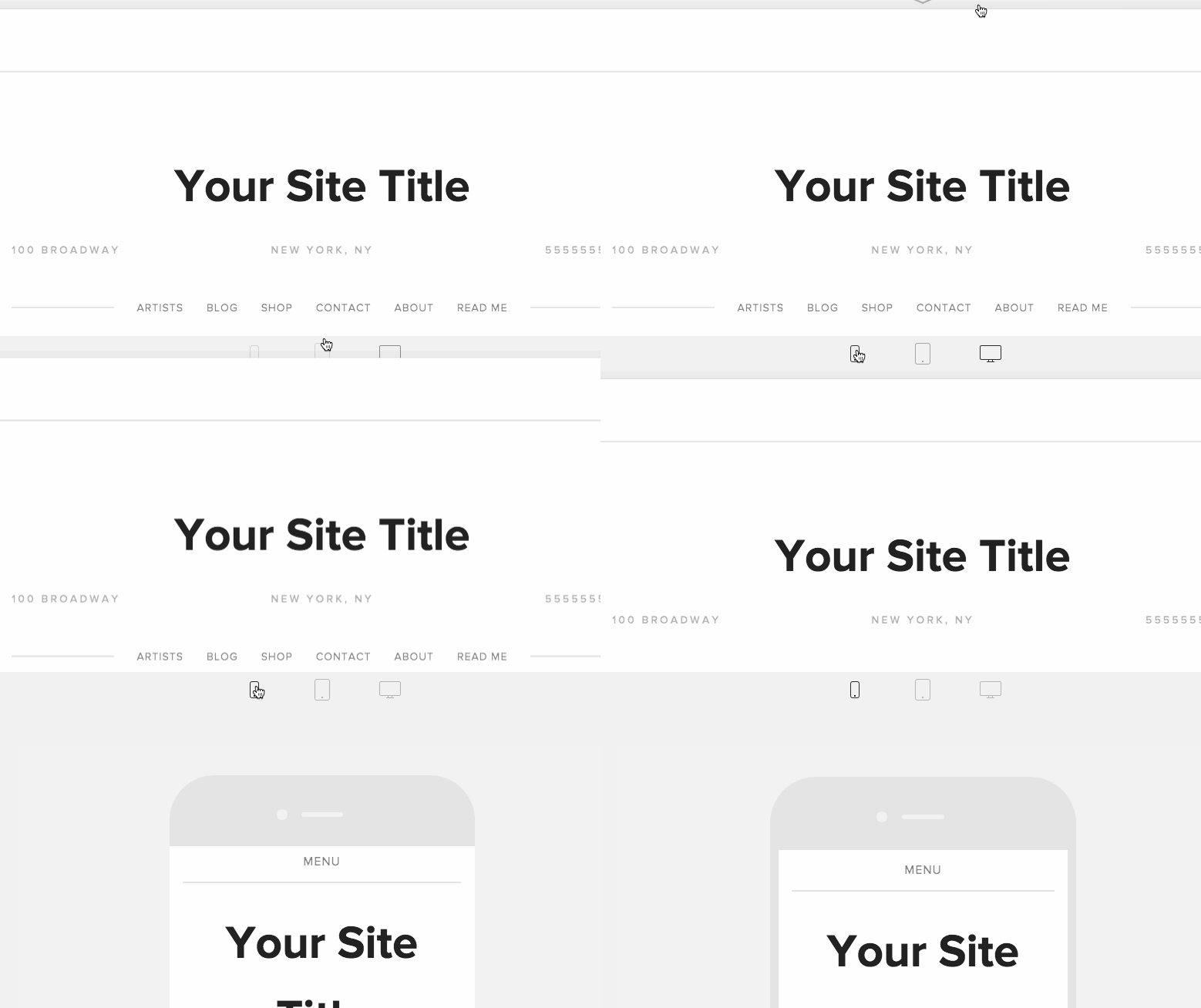
- With an ever-increasing number of website page views occurring on mobile devices, having a website that is mobile responsive (meaning it dynamically changes appearance for the best mobile viewing experience) is something you should highly consider when choosing a website-building solution. And for mobile, Squarespace truly shines. All of their templates are mobile responsive and look beautiful on a full monitor or a five-inch phone screen. The below graphic, compliments of Squarespace, illustrates the mobile viewer option you have when building your website:
- Beautiful simplicity is one of the first elements you’ll come to appreciate when using Squarespace. While the other website builders have tried to check all the boxes of functionality, Squarespace has purposefully kept it simple in an outstanding effort to make it beautiful. For example, while Wix and Weebly both have rather robust third-party app marketplaces, Squarespace only supports the bare minimum necessary to build a good site. While some see this as a major con, I tend to see this as a positive differentiation point for Squarespace. They are very Apple-esque in this approach. This design approach also tends to make websites built on the Squarespace platform look more regal and higher-end.
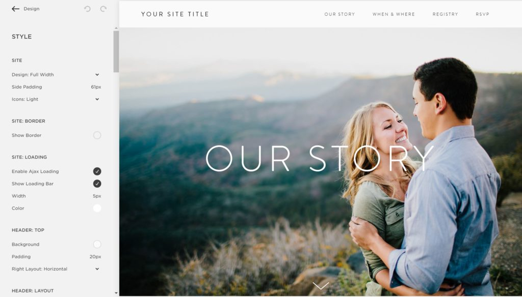
- As the two other strengths indicate, Squarespace really thrives on beautiful design. While they don’t have a huge collection of templates to choose from (see the third “weakness” point below), those templates they do have are the most customizable, when comparing them to Wix and Weebly. Squarespace is the most design conscientious of the three solutions. As such, Squarespace includes the most robust set of styling options.
Squarespace weaknesses:
- The web building community, which received Squarespace with open arms years ago when the platform launched, has seen the company spend less money on development and more on gaining new customers: something that has shown as they’ve slowly lost ground, feature-wise, to their main competitors, Wix and Weebly. Squarespace does not publish a changelog, and only occasionally releases update notices to their blog. Weebly also doesn’t have a centralized changelog but has been more active in communicating updates on their blog. Wix, on the other hand, has a well established and active changelog, keeping them accountable for new product updates with their customer base.
- When scrolling down the list of options under just their “Style” menu item, even on my super high-resolution screen there are still six scrollable pages/sections of options to choose from! This can be nice, but I’ve seen it create problems with clients, where they are often overwhelmed by the variety of options available to them. I often have to tell my clients to dial it back, and not worry about customizing too much.
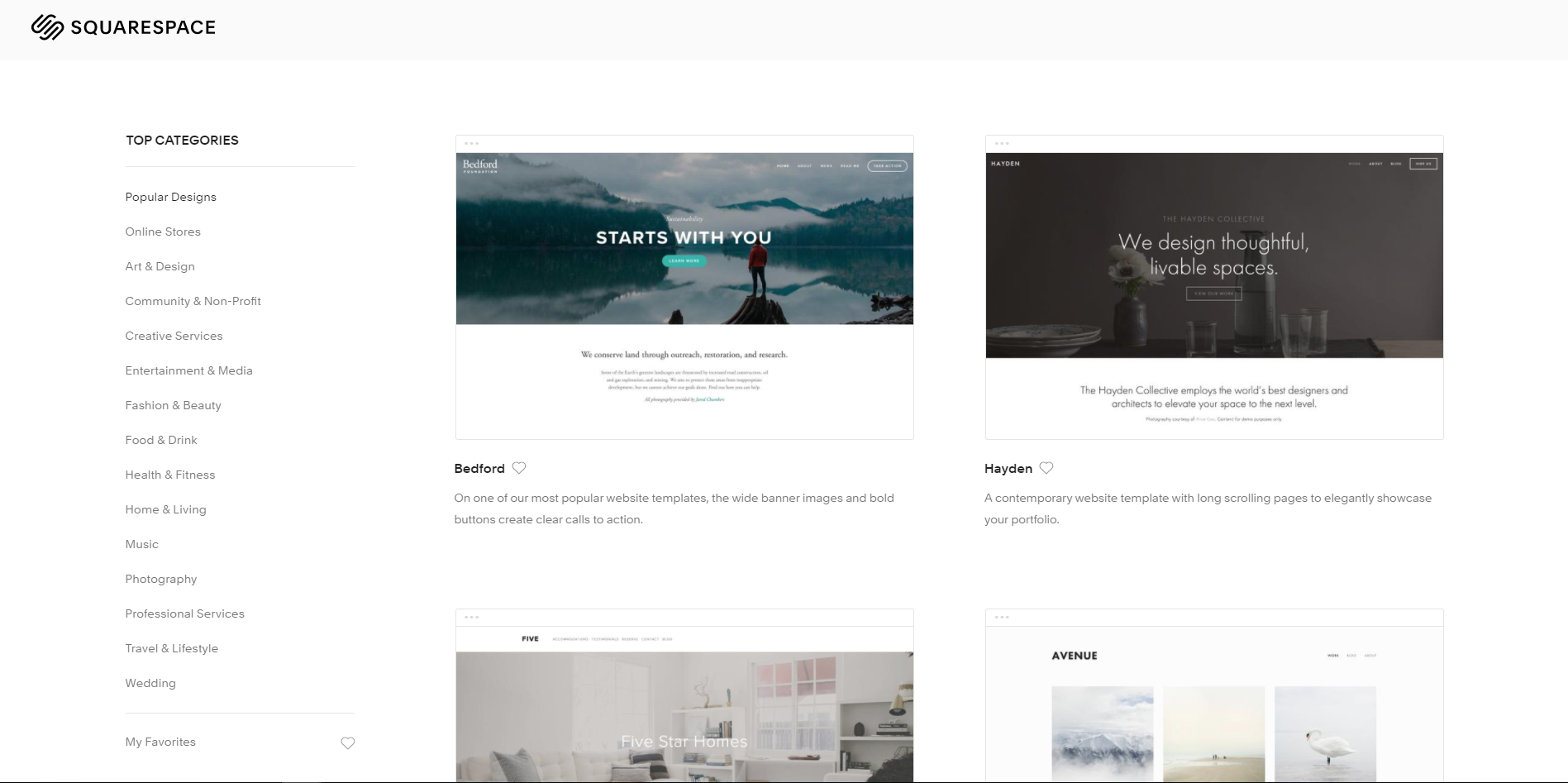
- I’m always surprised when I pull up a new Squarespace instance to build a website for a client and I see how few template options there are. Squarespace prides itself on having the most robust creative design experience, and yet they have fewer than 75 templates. In fact, when I first wrote this comparison, in 2017, they had around 60 templates… and now they have just slightly more than that, at 64 templates. They also don’t allow for outside templates to be installed, so you’re really stuck with the options they give you off the bat. That said, the configuration of those templates is most robust on Squarespace, somewhat saving this platform from being completely sunk on the design flexibility comparison metric.
Pricing:
Starts at $12/month when paid annually (pricing page)
Grade:
B (3.1 out of 5 possible points)
Using Weebly to build your brand’s website
Weebly is an extremely easy to use product, and over the past two years has redone its interface and cleaned up its theme library to bring it up to date… on par with the beauty of Squarespace’s backend configuration portal. While they were once growing very quickly as a company, it appears their popularity has waned since 2015 or so. Can their April 2018 acquisition by Square put them back on the map?
Weebly strengths:
- Like Wix, Weebly has an email marketing solution, called Weebly Promote, built into their website builder package. Though it is a paid add-on, and it is somewhat pricey compared to the pricing of your website builder package, it’s nice that they have it here. For a smaller business who doesn’t want to have to open up multiple tools and learn new platforms, it can be considered a strength. It isn’t as powerful as MailChimp or similar email sending platforms, but it is very easy to use and should fulfill the needs of most small businesses.
- Weebly has one considerable advantage over the competitors, and that is easy-to-use page layouts. With more than 40 in total, these pre-designed page layouts make building a new website on Weebly a much more delightful activity, especially if this is your first time building a website and you’re not entirely sure where you should put your content.
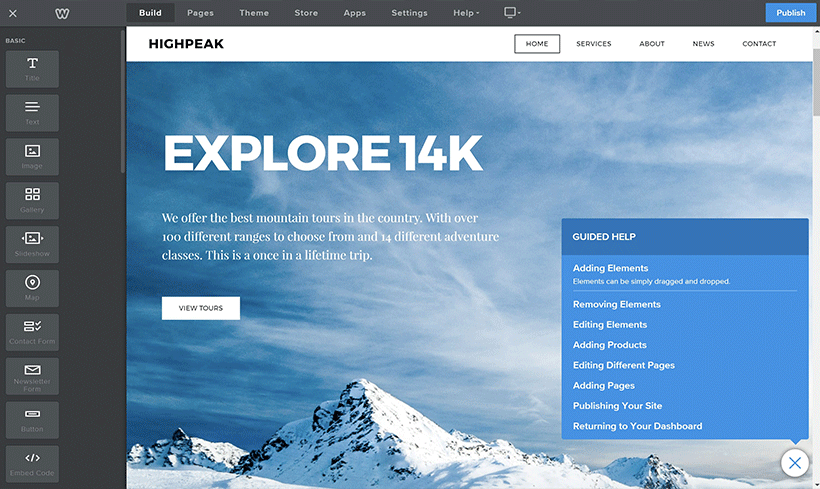
- When designing a site in Weebly for the first time, you are presented with a “Guided Help” dialog that helps walk you through each step of the way. Because it is in the app (sitting there as you build), it is extremely easy to get to. The content is helpful enough that someone with absolutely no website-building experience should be able to put together a beautiful website.
Weebly weaknesses:
- Weebly was acquired by Square, the leader in mobile credit card processing, in early 2018. While the acquisition by Square may lead to better payment processing options in Weebly, in the last 6 months there hasn’t been as much development by Weebly, signaling what may be an internal restructure from Square that has hurt Weebly. For example, while Weebly has a beautiful and easy-to-use website builder, their selection of pre-built themes is lacking, and like Squarespace, they haven’t added a lot of theme offerings over the years. With less than 75 themes available to you, there isn’t as great of a creative option as there is with Wix. My hope is that Square is simply restructuring some things and then will re-invest in Weebly’s development.
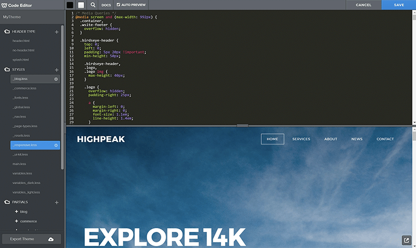
- Many web designers and web developers geek out on editing HTML and CSS to customize website themes. If you’re reading this article though, you’re likely not one of those individuals. Your priorities are more focused on marketing or running a business. While Squarespace and Wix both allow you to make template customizations with the drag and drop editor, Weebly falls a little short here. Yes, they’ll allow you to edit colors, fonts, etc… but any real customizations with Weebly require that you open up the code editor.
Pricing:
Starts at $5/month when paid annually (pricing page)
Grade:
B+ (3.4 out of 5 possible points)
The grading criteria and rubric
These products are all fabulous to use, and I honestly don’t think you’ll go wrong with any of them. While I love the Squarespace interface and design aesthetic, each different website-building platform offers its own unique value.
Who should use Wix?
I would recommend Wix more for beginner to intermediate users who want a lot of theme options, a beautiful site, and a little more customization of their website but are okay with not having the best blogging options. Additionally, Wix’s mobile app is great for service type businesses, such as hair salons, accountants, etc.
Who should use Squarespace?
If you are a design connoisseur, or if your business needs demand a high-class visual aesthetic, then Squarespace is for you. Classy all the way.
Who should use Weebly?
Weebly is a great tool for absolute beginners, someone who isn’t looking for a ton of customization and is pleased with the themes already available to them. I rank it as the easiest to use. So if you have no experience building websites, then this may be the best solution for you.
