My mother used to always tell me that behind every good content marketer there is a good graphic designer.
Okay, so maybe that’s not how the phrase went… But as all content marketers know, the phrase is nonetheless true.
As ClearVoice’s platform continues to provide new, valuable offerings to the clients hiring through it, a greater number of graphic designers are coming to claim their place on the platform. This great momentum is helpful to content marketers, such as myself, that historically needed to turn to other locations for the graphic design help needed to polish up ebooks, infographics, etc.
How can graphic designers showcase their skills online?
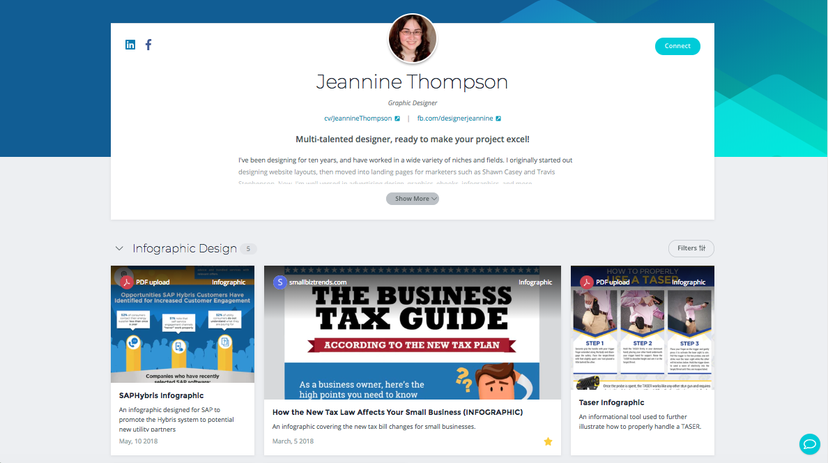
In an effort to help these graphic designers better showcase their skills and abilities, ClearVoice has made great improvements to the aesthetic layout and functionality of their online graphic design portfolios. For example, when a freelancer builds their CV Portfolio they are asked to select which roles they’ve participated in through their content marketing freelance projects. Photography, Graphic Design and similarly related skills are ones that contractors can highlight. As a specific example, Jeannine Thompson, highlights her infographic skills in her portfolio.
While ClearVoice provides the platform and means whereby graphic designers or other artists can showcase their skills online, there are still some important aspects that designers must take into consideration when prepping their online portfolios.
In hiring graphic designers for my own projects I’ve often found myself asking “all of these designers have beautiful work, but how can I tell what their actual skills are in relation to the project I’m launching?”
In hopes that it might be helpful to graphic designers looking for online freelancing projects, I’ve turned to two experts to get their advice on how to build a portfolio that goes beyond the eye candy, and really focuses in on a designers skill set with software tools. In addition, these experts took it to a new level and identified some excellent methods to showcase beyond the skills and eye candy, focusing on the ability of graphic designers to solve business problems and communicate how the designer will provide true value to the hiring client.
Advice from design experts inside of academia and industry
You’ll notice that I’ve turned to both a designer that works inside of academia and a designer that works solely in industry. The reason I’ve leveraged expertise from these two ends of the design spectrum is to ensure that you, as a graphic designer, have the best advice, in a fair and non-biased manner. This way, as you build your own ClearVoice Portfolio, you’ll know how to garner the most business for your own freelancing business.
Because I asked many of the same questions to each of these graphic design experts, I’ve laid out their advice in a question/answer format, giving each expert an opportunity to weigh in on the topic. Each designer had some unique insights to share, and you’ll find that each imparts valuable knowledge.
As a way of introductions, I’d first like to tell you about each graphic designer I spoke with.
Carol Sogard, Head of the Graphic Design Program in the Art Department at the University of Utah, has been teaching graphic design since 1999. In addition to her extensive experience teaching a variety of topics, including typography, information graphics and studio art, she also has built her own knowledge of graphic design best practice through working in industry, collaborating on projects with UNICEF, numerous centers of art, and dozens of business clients.
Adam Black, a Visual Design Manager at TD Ameritrade has his own rich experience in graphic design best practice, having worked in the field since 2006. He has worked in freelance and as a corporate designer for organizations such as the Wounded Warrior Project, Utah State University, and Enspark. He currently manages a team of visual designers at TD Ameritrade as they create content for investor education programming.
What follows is the best advice I received from talking to these two expert designers.
Q: What are the top five tools you think a graphic designer should know to make themselves most marketable in freelancing?
Carol Sogard brought some interesting perspectives concerning soft skills that are necessary for making a freelance graphic designer more competitive:
There is a desire to identify just a short list of things that a designer needs to know in order to make oneself marketable as a freelance designer. Yet in today’s marketplace a designer must wear many hats. Conceptual thinking is essential. Designers must understand how to take abstract concepts and translate them into clear, concise, aesthetically pleasing visual communication. Designers must be able to digest and identify hierarchy within content, extracting the key message and narrative prior to embarking on the design of that content. At this point, when the design solution is developed, it is essential that a designer understands how to use the software tools necessary for execution.
If you want to break it down further it goes like this: ideation, conceptual thinking and trying to solve a problem. Communication skills are also important. For example, interpreting the provided language or content and best articulating and reinterpreting it in a more precise form that can be clearly communicated to an audience.
Adam Black focused more on tangible software tools, versus the soft skills Carol talked about:
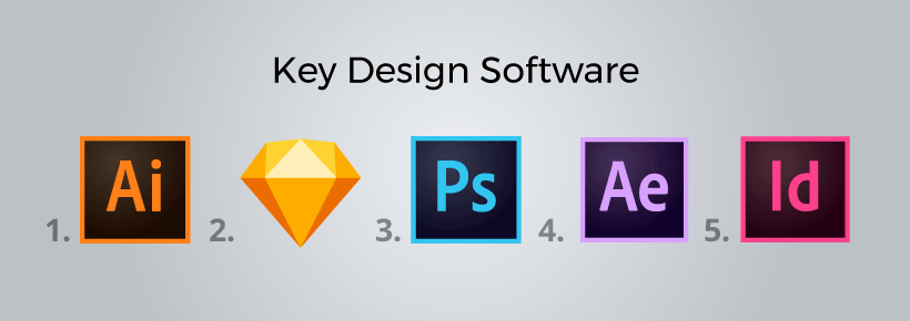
To be most marketable, I think the tools that are most important to helping freelancers acquire more business, ordered from most important to least, is:
- Adobe Illustrator (most important)
- Sketch
- Adobe Photoshop
- Adobe After Effects
- Adobe InDesign
Q: How can a designer visually contextualize that they have skills with those different tools?
Adam shared some helpful advice about not attempting to be a “Jack of all trades, master of none.” He explained that prospective clients generally hire based on a more narrow skill set, and don’t necessarily trust a portfolio that is too diverse:
Proficiency is best shown through portfolio work. Because each tool creates such a different product, proficiency could be assumed by the type and quality of work within the portfolio. If you have great vector illustrations, I assume you’re an expert in Illustrator. If you have amazing concept art, you are good at Photoshop.
I would not necessarily recommend trying to show proficiency in all of these tools, however. Likely, a designer will have an expertise in one area of graphic design and they will want to cater their portfolio to show proficiency in only the tools needed to achieve that result. As a hiring manager, I would only be interested in making sure they could do the job I need them too. A designer that is too well-rounded is not as good as an expert in one area.
Carol added to Adam’s advice with a discussion on the importance of building a narrative around your portfolio works:
Here’s where the marketing comes into play, by looking at what you built and how it directly affected the company it was built for. Look at the results. Did they increase business for this product or service? Did they better communicate our companies vision? Whatever the goal is, there should be a narrative that accompanies your portfolio.
You also need to define what your specific role was in the project. We live in a collaborative world and don’t work by ourselves, so tell the person that is potentially hiring you what involvement you had in that project. What strategic level did you participate in? Did you lead user-focused idea generation? Did you take photos yourself? Did you have to take written content and heavily edit that content before working with it in a design form?
Similar to Adam’s advice of not making your profile too diverse (thereby watering down your key strengths), Carol also explained the importance of being concise in your narrative:
You need to deliver this narrative in a concise way, editing it all down to the most important parts so that your design work is made more credible without taking away from the eye candy and beauty of your work.
Q: What is one of the best online portfolios you’ve seen from students, colleagues, or other experts you’ve worked with? What makes it the best?
As a professor, Carol has seen a slew of design portfolios. She shared two of her favorites:
McKay’s portfolio does a great job of showcasing the work and offering background on the creative process that was taken to arrive at a solution. It might be a bit light on narrative. He could expand on what his role was in creating and executing the projects.
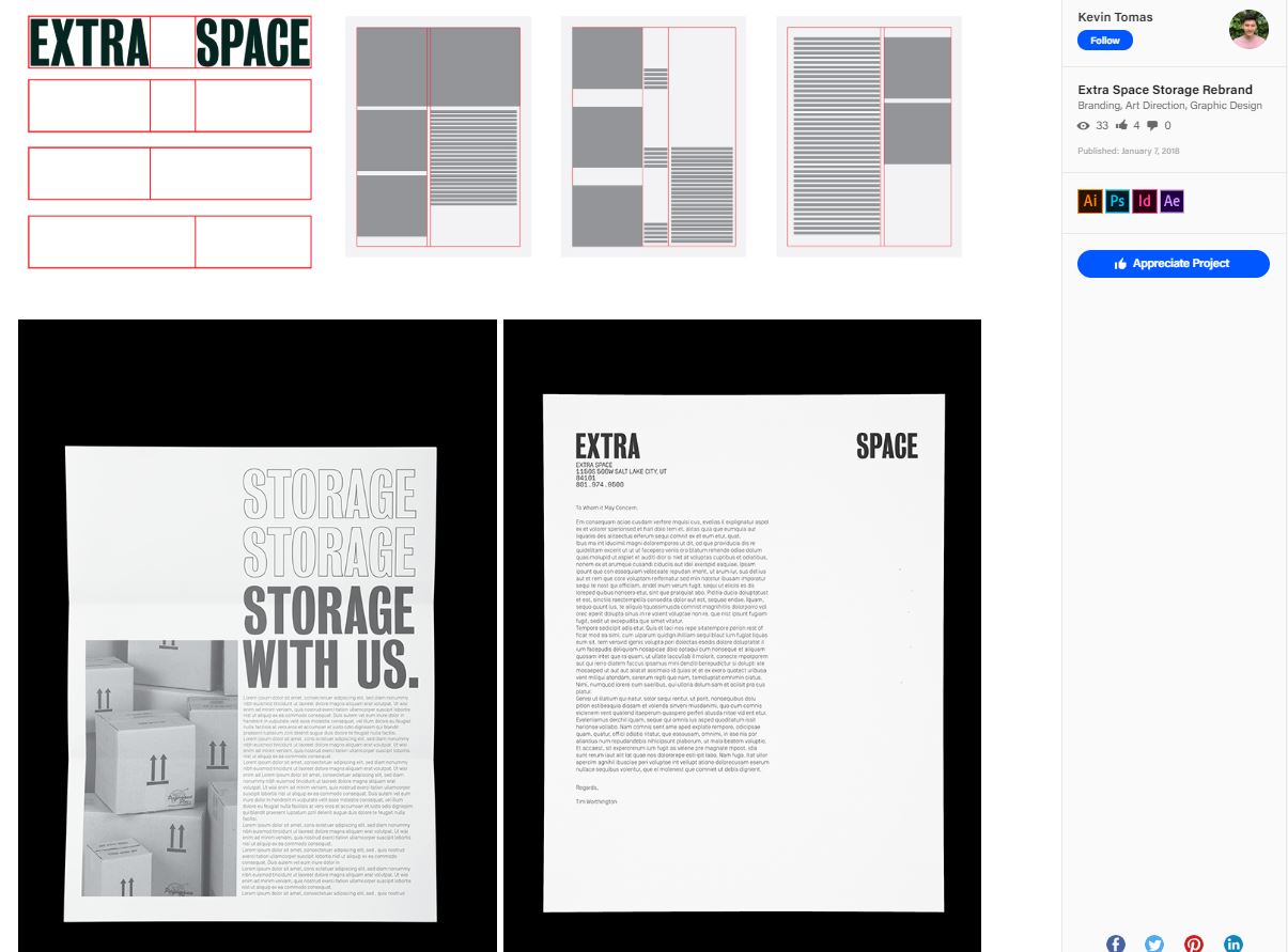
Kevin Tomas has a fantastic portfolio. He does a great job of showcasing the work and building narrative around the process that was used to arrive at the deliverables, and what his involvement was in the work.
While Carol shared several examples of portfolios she thinks are well done, Adam further explains some characteristics of a good online portfolio:
The best portfolios display extensive, high-quality design work. I prefer portfolios on Behance or Dribble, rather than a stand-alone website because they’re easier to find, usability is consistent, and you can follow the designer. A portfolio with a few great pieces is OK. A portfolio with a few great pieces and a few terrible pieces is terrible (A portfolio is only as good as its worst piece). A portfolio where the designer is consistently posting inspiring work is awesome. This is a designer you want to follow.
Q: When learning these tools, what are some of the best practices to ensure the graphic designers are truly learning the tools the right way?
Adam shares advice that there are so many ways to use a tool, and that instead of focusing on how you’re learning, you should focus on learning a lot through creating a lot:
There is no right way to learn or use the tool. What matters is the work you produce. Best practice is just that – practice. Create a LOT, look at a TON of quality inspiration, try new things and get feedback from GOOD designers. The only wrong thing you can do is the same thing over and over. If you create awesome work, it doesn’t matter how much you know about tools.
Carol added to Adam’s thoughts, about the importance of emphasizing strategies and soft skills in learning these tools:
One thing that we need to be careful of, and that I tell new instructors who I’m hiring to teach classes is, that while you’re asking students to work in these programs, the class is not a tutorial class. We’re not providing tutorials on how to use the Adobe Creative Suite. Instead, we’re teaching students how to take concepts and explore design messages digitally, outputting solutions for a specific business problem you’re trying to solve. In that process we do instruct the students on some best practices and ways to best leverage the tools, but we’re not walking them through every aspect. It’s more effective this way.
As a practicing designer, if I run into a problem, I might feel that there is a better way to actually make this thing do what I want it to do. In that case, I go to Adobe’s video tutorials and type in what I want to find. I almost always find quick and easy tutorials on what I’m looking for. In our graphic design program, we focus more on conceptual thinking, visual aesthetics, and the communication part of it, knowing that we’re giving them skills to solve the actual problems and work through their design needs on their own, in case they’re running into problems at 2 am in the morning.
As you know, there are 20 different ways to do the same thing in Photoshop, and it is constantly changing. Adobe is constantly improving its software and offering new apps. It is changing on a day to day basis, so we teach our students to work smart and proactively seek out information on their own, in order to help them leverage the software to work through their design problems.
Q: Thinking about content marketing’s usage of graphic design, do you have any specific advice for tailoring a graphic designer’s online portfolio to better speak to how their skills with different tools can be used in the creation of content marketing assets?
Carol discussed the importance of thinking of and representing your design as a whole:
Don’t think of design as an artifact. For example, “today I’m going to create a poster.” Instead, think of design as a whole brand strategy. Identify specific things you need to communicate and then identify the different platforms you’ll be utilizing: online, print, social media, etc. Think about how one visual piece is most likely part of larger system of communication. A portfolio needs to explain and show examples of how the featured design projects support an overall brand system that solves a business problem. For instance, a poster is just an example of one communication platform, amongst many. Show how the whole design system works and what you contributed to that system.
Adam spoke to the importance of creating works, and adding them to your portfolio, that reflect the kind of gigs you want to win:
My advice would be not to worry about the portfolio or the tools, but the work. Create the work that reflects the job you want. For content marketing, I’d say learn to make gifs, video and engaging graphics and illustrations, maybe? This will fill your portfolio and teach you the tools. Then, if you put in enough effort and have enough talent, you’ll be ready for the job.
Additional tips for optimizing an online graphic design portfolio
With Adam and Carol’s expert advice, I’m hopeful that you now consider yourself a “portfolio pro.” But you’re not done yet. Ther are a few additional tips you should consider as you optimize your online portfolio:
Keep improving.
Justin McKinley, in his article about how freelancers can improve their portfolio, talks about evolution and continual improvement being a key to making sure you get the attention of prospective clients. He shares, “Keep moving forward. Treat your portfolio as a living art exhibit that’s constantly evolving and attracting new patrons. Freshen your portfolio with your latest work and occasionally showcase older work in a new light or context. Don’t be afraid to be your own critic, or to change.” One comment Adam Black made to me, in the above-highlighted interview was that “A portfolio where the designer is consistently posting inspiring work is awesome. This is a designer you want to follow.”
Master your inner schizophrenic.
If you’ve worked in industry for very long, you’ve likely realized in the world of marketing and design you need to wear multiple hats. In his article about branding yourself to gain more business, Gregg Rosenzweig shares “What you call yourself title-wise matters and is likely one of the first things someone reviewing your portfolio will want to know.” In short, what Rosenzweig is recommending you do is to list different roles/titles on your portfolio projects, depending on who you think your audience (potential client) is looking to hire.


