Many a marketer has heard about the fold, but not everyone may be completely familiar with it. Understanding specifically what it is and how it can affect your website’s conversion rate can be the difference between more money or lost revenue.
While some believe that many users and site visitors do scroll down the page, others aren’t so sure. Who should you believe? I take an in-depth look at the fold, so you won’t have to lose conversions and sales.
A refresher on the fold
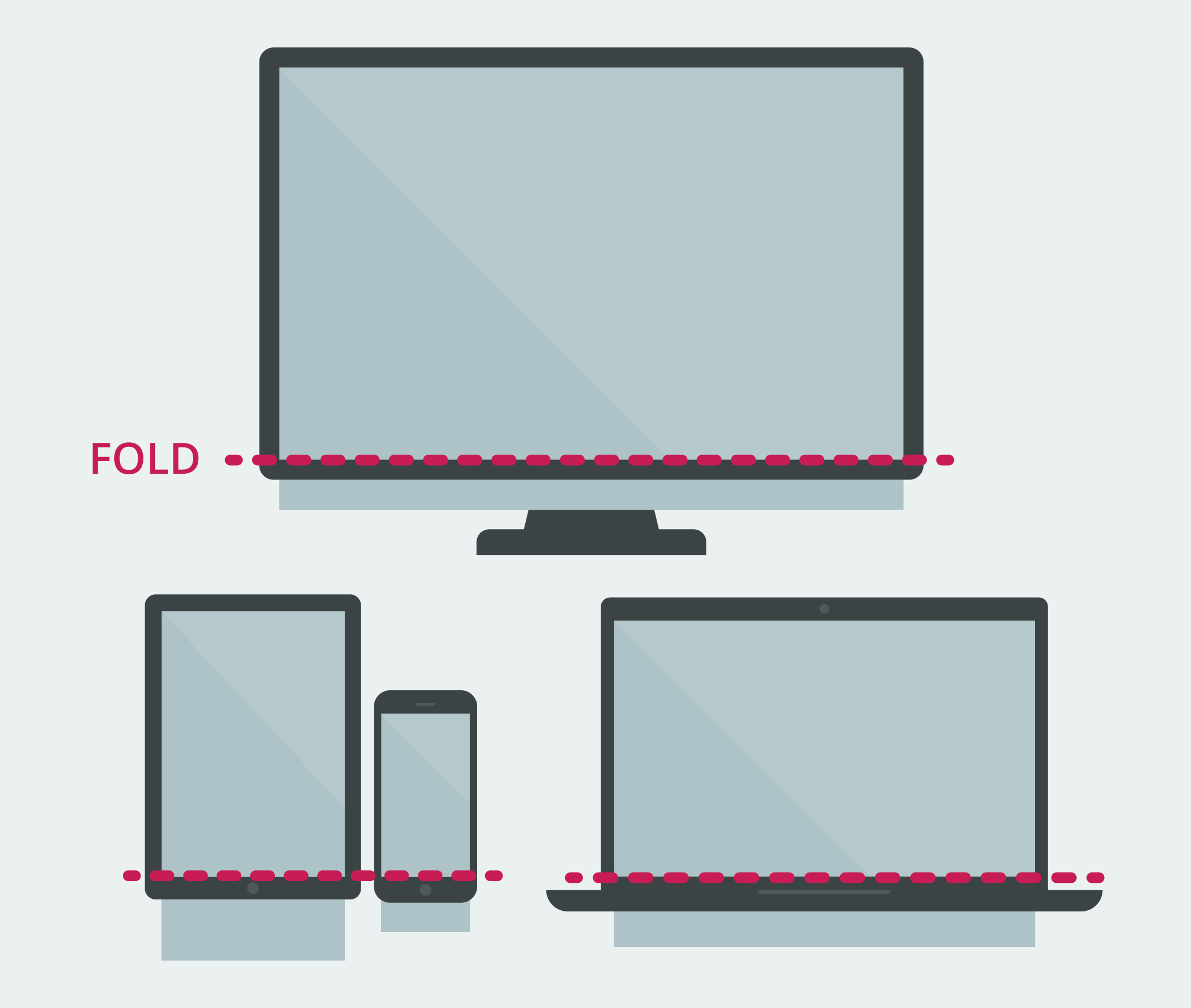
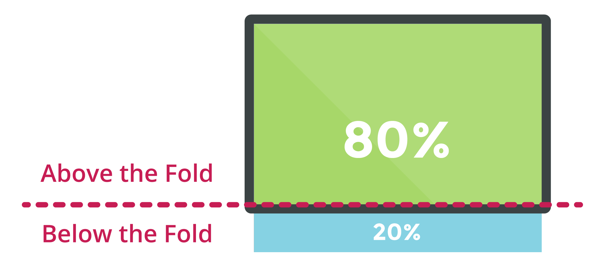
 “Above the fold” is the area of a website that you see on your screen when you first land on any given webpage — the part of the screen that comes before you have to scroll down to see more content. The term comes from the days when newspapers were displayed on newsstands, and the juiciest, most important news items were placed on the top half of the front page — above the fold. Today, anything “below the fold” means you have to scroll to see it. This applies to desktop, tablet and mobile screens.
Some marketers have gotten used to the idea that it’s perfectly fine to place vital content — such as calls to action, web forms, etc. — below this fold. They believe that your users (leads, customers, etc.) will scroll down automatically with no problem. Kissmetrics even published an article arguing that it doesn’t matter where on the page you place your CTAs, because it has “no bearing whatsoever” on conversion rates.
The belief is that customers can also convert below the fold… if the moment at which they become convinced to convert occurs below the fold.
That would be nice, except research should make you think twice about putting important calls to action below the fold, if you actually want it to get seen in the first place.
Why putting content below the fold can hurt your bottom line
Statistically speaking, content that’s above the fold is a lot more likely to get seen. That means, obviously, that content below the fold has a much less chance of being seen. Visitors who don’t even scroll down to see your call to action aren’t going to be able to click on it to convert, period.
The research that’s calling into question the belief that it doesn’t matter where to put your call to action comes from NN Group’s eye-opening study on the fold.
In this study, this user-experience firm looked at 57,453 eye-tracking fixations to determine conclusively that there’s a shocking drop-off in user attention above versus below the fold. The reason that many more users in its study actually saw the content above the fold was because they simply didn’t want to scroll below the fold to see what was there.
Specifically, the 100 pixels right above the fold got seen 102 percent more than the 100 pixels immediately below the fold. Just stop for a second and think how much that 102 percent can equal in terms of all-important conversions. For its study’s sake, NN Group defined “seen” as where on the screen users actually looked and then how much time they ended up looking at that section.
It’s not just one study saying this
If it was just NN Group’s study showing huge and impactful viewing differences between content that’s above versus below the fold, it could be written off as just an outlier… a one-off. However, another study, this one from Google itself, also found the same visibility issues with content placement.
In its appropriately titled “The Importance of Being Seen” study, Google concludes that ads above the fold had a 73 percent rate of visibility to users while those below the fold had visibility of only 44 percent. That’s a staggering decline of 66 percent, above versus below the fold. To be clear, while this Google study looked at how well ads fared, the overall point is that content — any content — above the fold tends to do a lot better just because it enjoys more visibility than anything below the fold.
Applying these two studies to your CTA buttons, it stands to reason that calls to action above the fold also do better than their below-the-fold counterparts simply because they’re seen so much easier and by more users.
Therefore, placing your calls to action below the fold can result in a substantial loss of conversions and revenue.
Here’s the exception
Yes, there’s one, huge exception to this rule. You can put your call to action button below the fold although it’s riskier and virtually guarantees significantly fewer people will see it. In some cases, you can’t even avoid this, as when you have a long landing or sales page, where your product or service may actually need a lot in the way of explanations, testimonials and images to help sell it effectively.
Here’s the only time you should really put your call to action button below the fold: when the content preceding it is so gripping, persuasive and interesting that visitors and users really want to continue reading and scrolling down the page. Usually, to achieve this, your pre-CTA content would have to use:
- Storytelling to prompt people to continue reading
- High-quality images to spur people’s interest
- Persuasion principles to hook people
As you can see, these strategies would theoretically craft compelling content that would motivate your visitors and readers to keep scrolling down.
However, this begs the obvious question, why not just put your call to action above the fold to take advantage of the far better visibility rate and also include compelling content there?
What this means for you
Some say the fold is irrelevant, but that’s not supported by two studies that say otherwise. Remember that anything below the fold will result in fewer views — including your call to action button. Therefore, go with the more high-traffic area, according to eye-tracking studies, which is above the fold.
Of course, sometimes you can’t avoid designing a long-scrolling webpage for a product or service that’s a bit more complicated and which, therefore, requires more content before you can get to the call to action. Make sure your content is compelling to increase conversions even below the fold.


