Proceed to checkout. That’s what you do on an e-commerce website when you’re ready to pay for the items in your cart. But how do you know you’ll get to the right page? How do you even know how to proceed to checkout in the first place?
Simple.
The site has prominent, visible, and easily clickable call-to-action (CTA) buttons. These buttons provide you with clear instructions about how to proceed.
In this guide, we’ll discuss why CTAs are important, what a successful CTA strategy looks like, and the best practices to remember.
What are CTAs?
A CTA is a brief instruction or statement that incites an audience to perform a specific action. For example, sign up for a webinar, download a whitepaper, join a mailing list, or buy an item on sale.
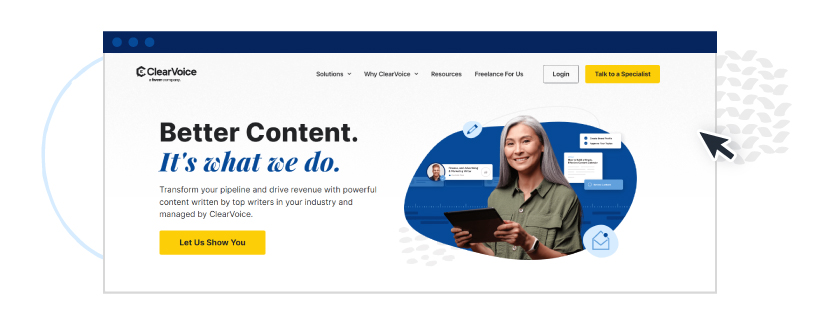
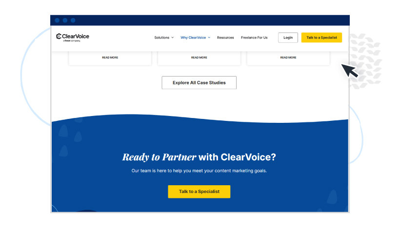
In the image below, “Talk to a Specialist” on the upper right-hand side and “Let Us Show You” at the bottom left are examples of CTAs.
CTAs are a marketer’s best friend for several reasons:
- Eliminate confusion: Clearly-defined CTAs provide clarity, which makes your web pages easier to navigate.
- Encourage action: Whether filling out a form or clicking on a relevant page, CTAs motivate the reader to take the next step.
- Improve conversion: A well-designed and well-placed CTA can radically improve the conversion rates of your website and landing pages.
- Help achieve business goals: Persuasive CTAs drive audiences to action. Each action coincides with a desired business outcome (generate more leads, increase sales, drive more traffic to your website, etc.).
What do the most effective CTAs have in common?
High-performing CTAs have the following elements:
Clarity
Your CTA should be easy to understand. It should say precisely what action you want your audience to take. Use simple, to-the-point language that leaves no room for interpretation.
Contrast
Use color contrast to make your CTA stand out from the rest of the page. For example, if your page’s background is white, use green, red, or orange for your CTA buttons.
Placement and size
Place your CTAs where they are easy to see. Preferably above the fold, in a pop-up, or at the bottom of a blog post. Also, your CTAs should be large enough to be distinguishable but not too large to overwhelm or look spammy.
Urgency
For your audience to take immediate action, your CTA should communicate a sense of urgency or a feeling of scarcity. Let them know your offer isn’t on the table forever.
Examples of language to use can include:
- For a limited time only
- Buy now to get 25% off
- Few seats left; reserve yours now
- Order now for free shipping
Value proposition
Your CTA should clearly convey what’s in it for the reader if they take action. For example, “improve your health,” “download our comprehensive guide,” or “get the templates for free.”
CTA best practices (and examples)
Aside from the key elements above, here are other tips and proven best practices to keep in mind when constructing your CTAs:
Use action-oriented words
Instead of the tired, oft-used “more information here,” make your CTAs more compelling with action words.
Some examples:
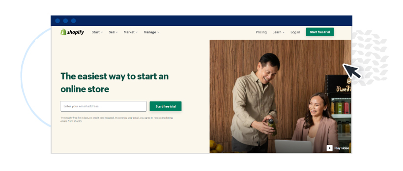
Shopify: “Start free trial”
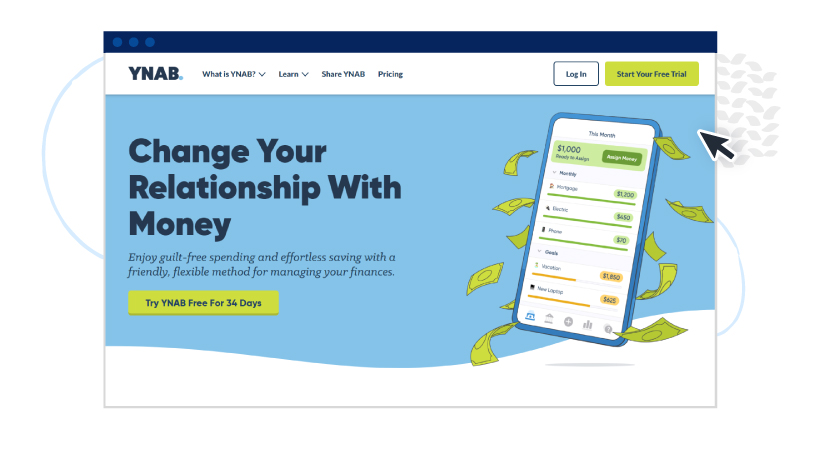
You Need a Budget: “Try YNAB Free For 34 Days”
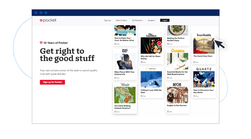
Pocket: “Sign up for Pocket”
Keep it short
Depending on whom you’re asking, the ideal CTA length is 2-4 words or a maximum of 5-7. The best way to discover is to experiment and see what works for you.
Some examples:
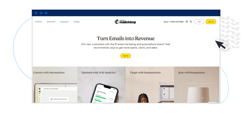
Mailchimp: “Sign Up”
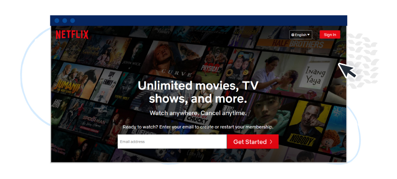
Netflix: “Get Started”
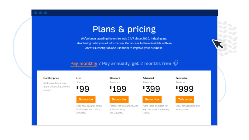
Ahrefs: “Subscribe” and “Talk to us.”
Add supporting text
We place so much expectation on the three- or four-word CTA, but the surrounding text also plays a part. So, don’t forget to include supporting text to make your CTAs more compelling.
Some examples:
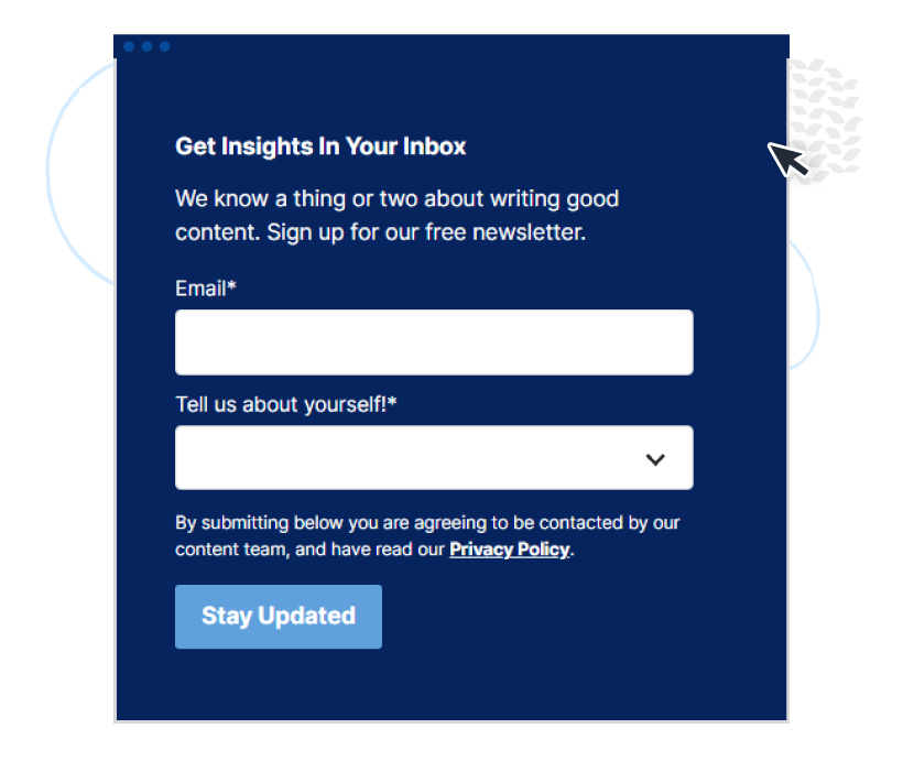
ClearVoice: You know right away that you’ll get tips on how to write good content even before you enter your email address.
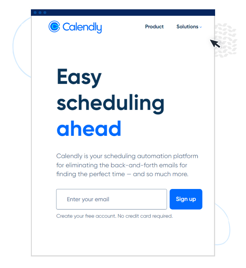
Calendly: If you don’t want to test-drive apps that ask for credit card information, the “no credit card required” message just might be the push you need to sign up.
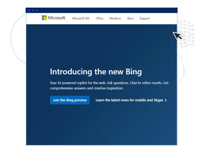
Microsoft: Help refine results, get answers to questions, and find inspiration. You know exactly what you’re getting into when you join the Bing preview.
Place your CTA in multiple places
Improve the chances of your readers seeing your CTA by placing it in more than one section of the page. For example, one above the fold and another at the bottom of the page.
Here are actual examples:
ClearVoice: “Talk to a Specialist” in the sticky header menu and the bottom section right before the footer.
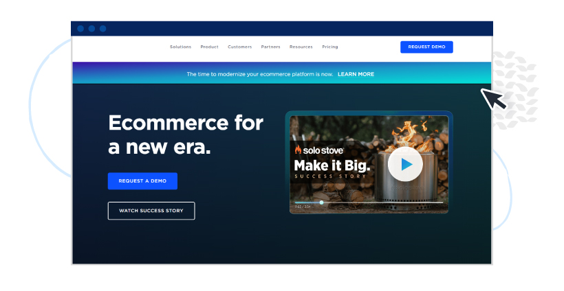
BigCommerce: “Request Demo” above the fold and in the sticky header menu.
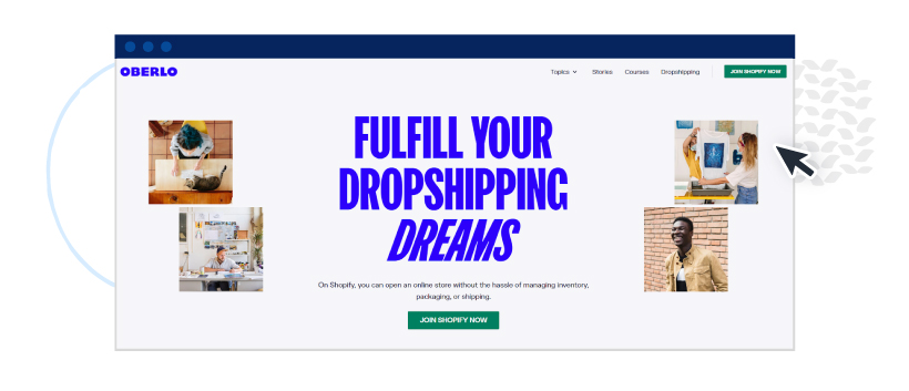
Oberlo: “Join Shopify Now” above the fold and in the sticky header menu.
Use whitespace to your advantage
Whitespace is the space between text, images, graphics, and blocks. Used properly, it draws your audience’s attention to your CTA and improves your chances of getting readers to click.
All the CTA examples above make excellent use of whitespace.
How to craft an effective CTA strategy
If you’re just starting with CTA marketing, here’s a step-by-step guide to follow when creating your CTA action plan.
Step 1. Define your goals
Like any other marketing campaign, goals are the first thing you define. What are you hoping to achieve? Generate leads? Increase newsletter signups? Drive sales? Boost website traffic?
Having clear goals enables your team to create CTAs that coincide with those goals.
Step 2. Know your target audience
To craft messages and design visual elements that resonate with your target audience, you must understand who they are. Know their pain points, interests, and motivations. Where do they live? How old are they? And so on.
If you’re running a membership site for seniors, for example, your landing page copy can look like this:
“Join our online community and connect with other seniors from the comfort of your own home. Sign up today and enjoy virtual events, exclusive content, and so much more!”
Then, your CTA can say, “Yes, sign me up!”
Step 3. Identify the channels to use
Decide which channels to tap, so you know the types of CTAs to craft. For example:
- Lead generation CTAs on websites, blog posts, email, and ad copy.
- Form submission CTAs on landing pages.
- “Read more” CTAs on blog posts.
- Product discovery CTAs on e-commerce pages.
- Social sharing CTAs on blog posts and landing pages.
- Lead nurturing CTAs that offer free trials, product demos, or free quotes on thank you pages.
- “Leave a review” or “buy now” CTAs on mobile apps.
When choosing your channels, ask yourself: Where is my audience most active? Where are they most likely to take action? Also, make sure the CTA fits the channel and doesn’t disrupt the user experience.
Step 4. Craft persuasive, actionable CTAs
Your CTA messaging must possess the three C’s: clear, compelling, and concise. Include social proof in your CTA copy. Also, as already mentioned, use color contrast to make your CTAs pop. Make them easy to find, hard to ignore but not obtrusive, and easily clickable.
Step 5. Test and improve
Run A/B tests on your CTAs to improve their performance. Change the design or placement. Test different versions of the copy.
Maximizing the value of your CTAs
CTAs, without a doubt, are an essential component of any marketing strategy. Knowing how to use them to your advantage can dramatically improve your conversion rates. Remember, to entice your audience to take action, make sure your CTAs are compelling, actionable, and visually appealing.
Need help with content production and best practices? We’ve got you covered. Reach out today to get started!
